From Dashboard to Decision Layer: Rebuilding DYOR for Crypto Investors
Client
DYOR
Year
2024


Helping crypto investors move from scattered token data to structured, confidence-building research workflows
Role | Sole Product Designer, DYOR |
Scope | Product strategy, UX research, IA, dashboard design, design system, usability testing, visual design |
Timeline | 6 months |
Constraint | Non-custodial blockchain wallet architecture. The second user-signed approval after a bank debit cannot be removed. |
I redesigned a Web3 analytics platform to help investors move from scattered token data to structured, confidence-building research workflows.
The strongest signal was not just higher engagement. It was the type of engagement. Users were returning through personalised research flows like watchlists, alerts, and saved tokens instead of only browsing static dashboards.
Product context
DYOR is a crypto analytics platform built for investors who want to research tokens, track market movements, and make more informed decisions. The product brings together token fundamentals, price signals, historical data, analyst notes, alerts, and watchlists into one research workspace.
The challenge was not simply to show more data. Crypto users already had access to many tools. The harder problem was helping them understand what mattered, compare assets quickly, and keep monitoring tokens after the first research session.
The problem
Crypto research is high-friction because users have to move across multiple tools, interpret unfamiliar metrics, and constantly decide whether a signal is meaningful or noise. Through research and product analysis, we identified three recurring problems.
1. Users were overwhelmed by raw data
The existing experience exposed users to a large amount of information, but the hierarchy was unclear. Important signals, secondary metrics, and deeper analysis often competed for attention. Users could find data, but they had to work too hard to understand what it meant.
2. Research workflows were fragmented
Investors were moving between multiple tools to check price movement, fundamentals, charts, token discovery, sentiment, and alerts. This created constant context switching. A user might discover a token in one place, validate it somewhere else, track it manually, and then forget to return when something changed.
3. Trust was difficult to establish
Crypto investors are cautious, especially when evaluating unfamiliar tokens. They wanted more than charts. They needed legitimacy signals, analyst context, clear summaries, and ways to keep monitoring an asset before making a decision. The core issue was clear:
DYOR did not need to become another data-heavy dashboard. It needed to become a guided research system.
Design challenge
How might we help crypto investors move from “I found a token” to “I understand whether this is worth tracking” without overwhelming them with raw data? To solve this, I focused the redesign around three product goals.
Product goal | UX direction |
|---|---|
Reduce cognitive overload | Create clearer hierarchy and progressive disclosure |
Increase research confidence | Add context, explanations, summaries, and trust signals |
Improve repeat engagement | Build watchlists and alerts into the research workflow |
My role
I led the product design for DYOR 2.0, working across research, UX strategy, information architecture, dashboard design, interaction design, visual design, and usability iteration. My responsibility was to transform a data-heavy crypto product into a structured research experience that could support both quick scanning and deeper analysis.
I worked on:
Product strategy and UX direction
User research synthesis
Dashboard architecture
Coin detail page structure
Watchlists and alerts
Filters, tables, and data-heavy interactions
Design system components
Usability testing and iteration
Research insight
Before redesigning the product, I wanted to understand how users actually researched a token.
What do they check first?
Where do they lose confidence?
Which metrics do they trust?
What makes them return after the first visit?
The biggest insight was:
Users did not need another dashboard. They needed a research sequence.
Most users were following a similar mental model, even if they used different tools.
Discover → Exploration → Evaluation → Decision-Making → Engagement & Retention
This became the foundation for the new product experience. Instead of organizing the product only around data categories, I redesigned it around the decisions users were trying to make at each stage.
Design system
The design system was created to make data-heavy interfaces feel consistent, readable, and scalable. The focus was not only visual polish. It was about creating reusable interaction patterns for complex analytics screens.
Key UX decisions
Standardized metric cards and table behavior
Created reusable filter patterns
Designed chart and tooltip components
Defined badge styles for status and movement
Built empty states for watchlists, alerts, and filtered results
Created consistent spacing, typography, and hierarchy rules
The design system helped DYOR scale without every new dashboard feeling like a separate product.
UX strategy
The redesign was guided by five principles.
1. Start with the decision, not the dataset
Every screen needed to answer one question clearly:
“What should the user understand next?” Instead of treating each page as a place to display everything available, I prioritized information based on decision relevance.
2. Use progressive disclosure
Crypto data can become overwhelming very quickly. The redesign introduced a layered structure where users could scan first, then go deeper only when needed. The goal was not to hide complexity. The goal was to reveal it at the right moment.
3. Add context before charts
Charts alone do not create confidence. Users needed summaries, labels, definitions, analyst notes, and supporting context to understand why a signal mattered.
4. Make monitoring part of research
Crypto research does not end after opening a token page. Users often want to observe an asset over time before making a decision. Watchlists and alerts were designed as part of the core research loop, not as secondary features.
5. Support advanced users without intimidating new users
Advanced users needed filters, deep metrics, and customization. Newer users needed useful defaults and clear hierarchy. The interface had to support both without becoming too complex for either.
Information architecture
The existing experience had valuable data, but the structure made users do too much interpretation on their own.
Before
Metrics were spread across dense dashboards
Important and secondary signals had similar visual weight
Discovery and monitoring felt disconnected
Users had to manually remember which tokens to revisit
Advanced data was available, but not always easy to scan
After
The new IA was designed around the user’s research journey.
Global Dashboard → Coin Detail → Watchlist → Alert → Return Loop
Each part had a clearer purpose.
The global dashboard helped users discover and compare.
The coin detail page helped users investigate and validate.
The watchlist helped users save assets worth tracking.
Alerts helped users return when something important changed.
This turned DYOR from a lookup tool into an ongoing research workspace.
Key design decisions
1. Rebuilding the dashboard around scanning behavior
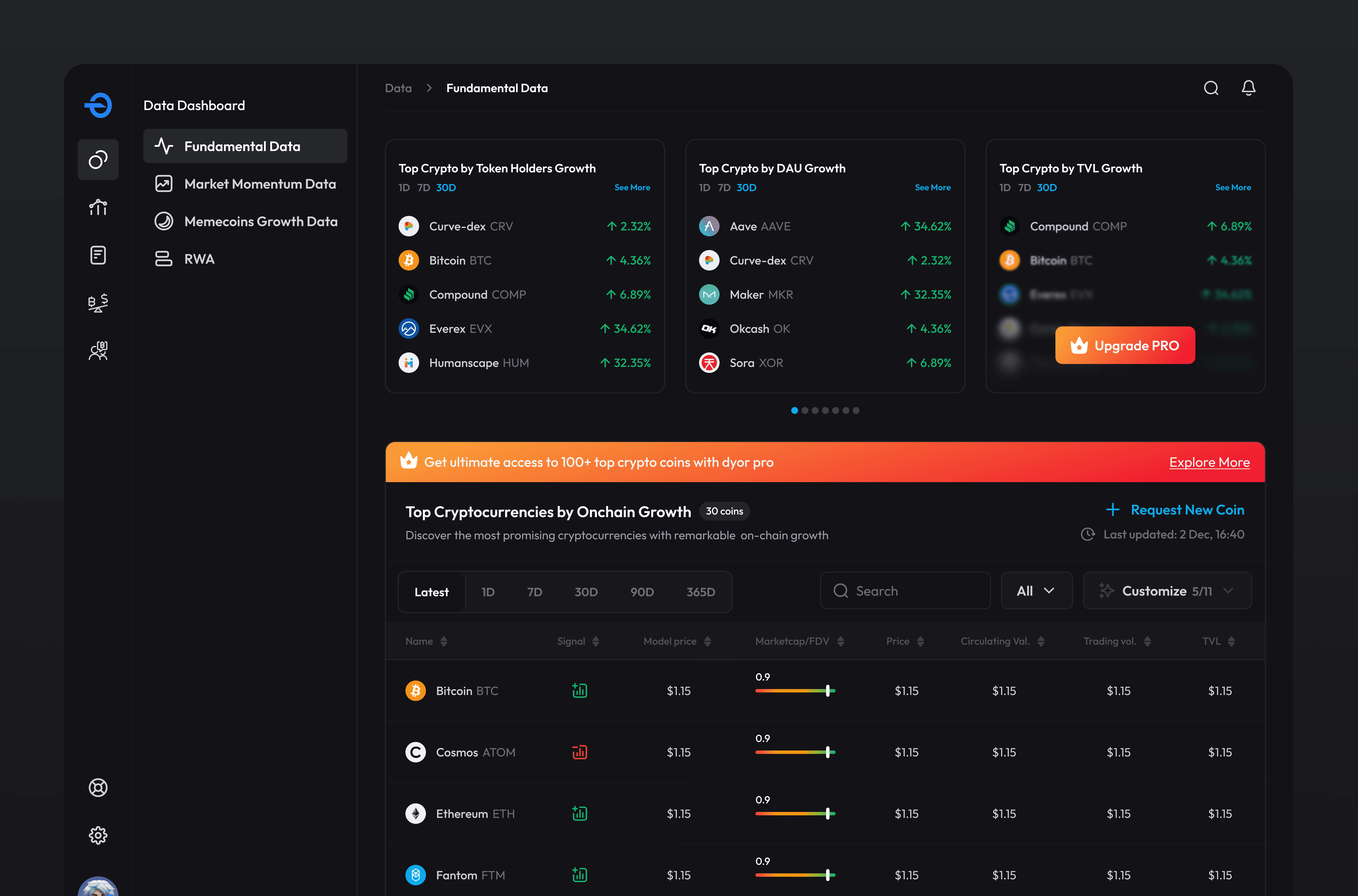
The dashboard was redesigned to support the way investors naturally scan opportunities. Instead of showing all data with equal weight, I created a clearer hierarchy between high-signal summaries, top-performing assets, custom metric tabs, filters, and detailed tables.
The goal was to help users answer three questions quickly:
What is moving?
What is worth investigating?
What should I track further?
This changed the dashboard from a passive data display into an active discovery surface.
2. Creating a three-level structure for coin pages
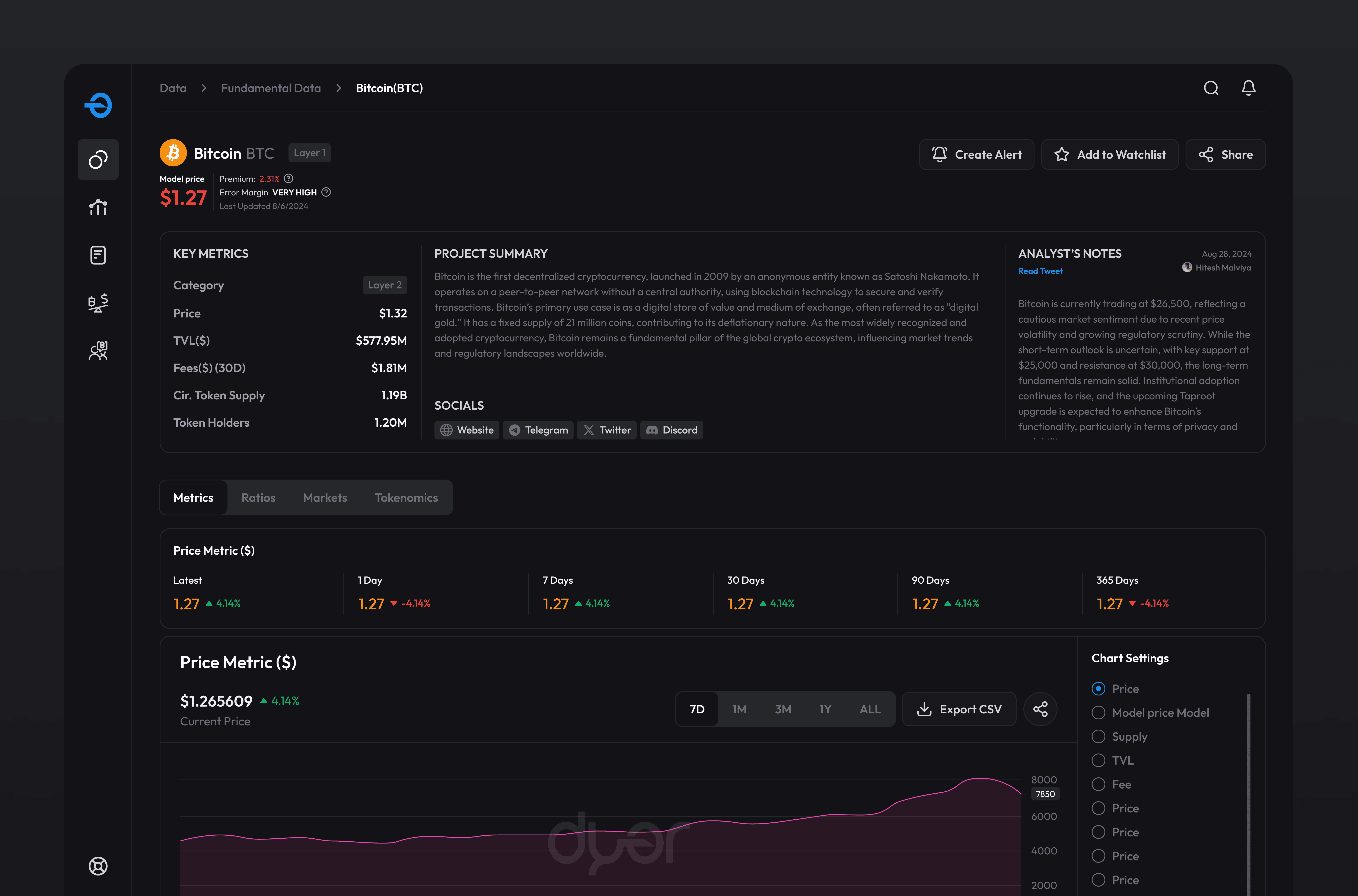
Coin pages were one of the most important parts of the product because they carried the highest decision-making load.
I redesigned them with a three-level hierarchy.
Level 1: Immediate decision signals
At the top, users saw the most important information first: price, model price, market movement, and core status indicators. This helped users form an initial impression without digging through the entire page.
Level 2: Context and confidence
The second layer provided supporting context such as project summary, key metrics, analyst notes, and legitimacy indicators. This helped users understand not only what was happening, but why it might matter.
Level 3: Deep analysis
The final layer gave users access to detailed charts, historical trends, metric categories, and expandable sections. This preserved depth for advanced users without overwhelming everyone upfront. The result was a page that worked for both quick evaluation and deeper research.
3. Turning research into a repeatable loop with watchlists
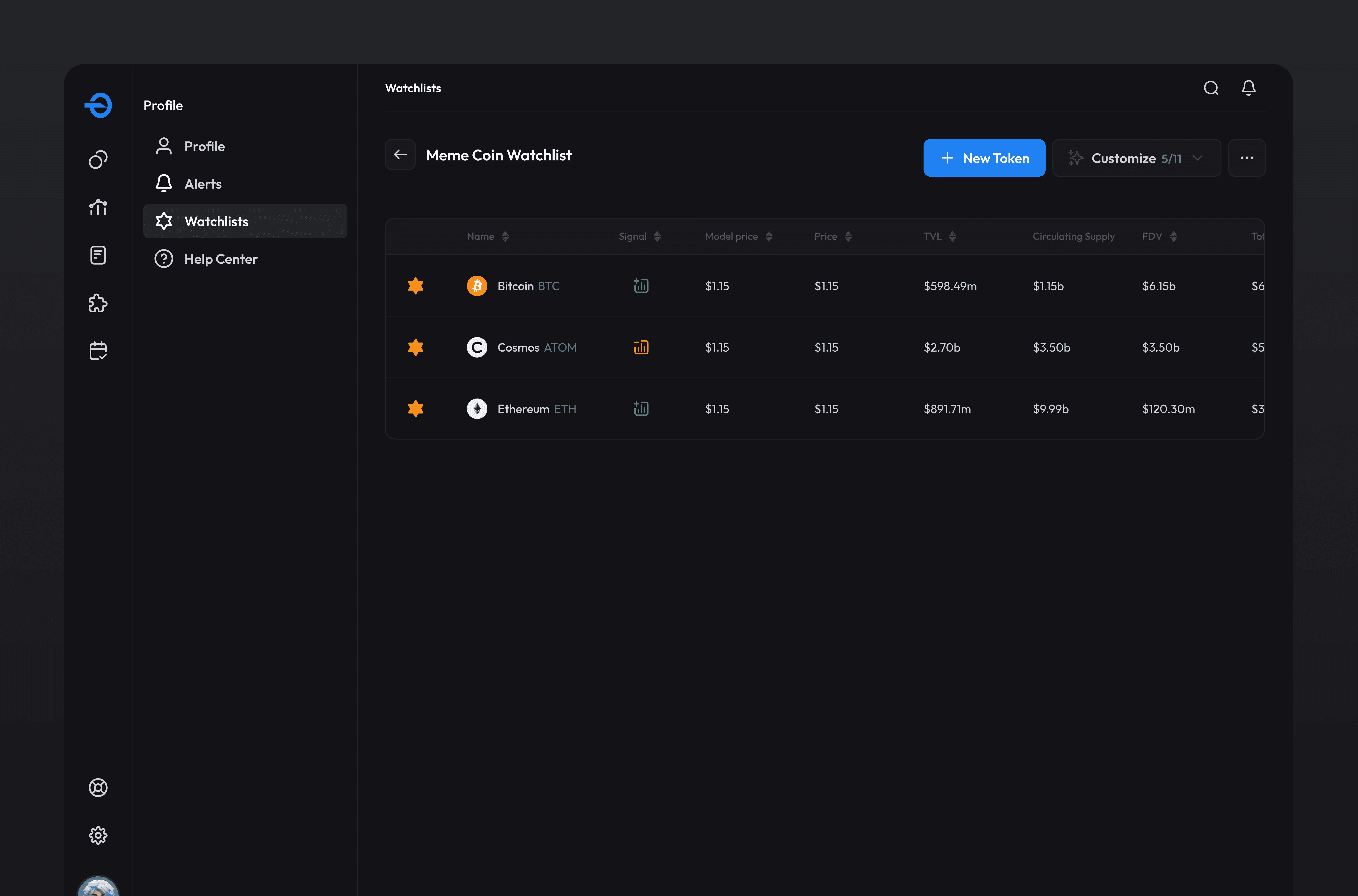
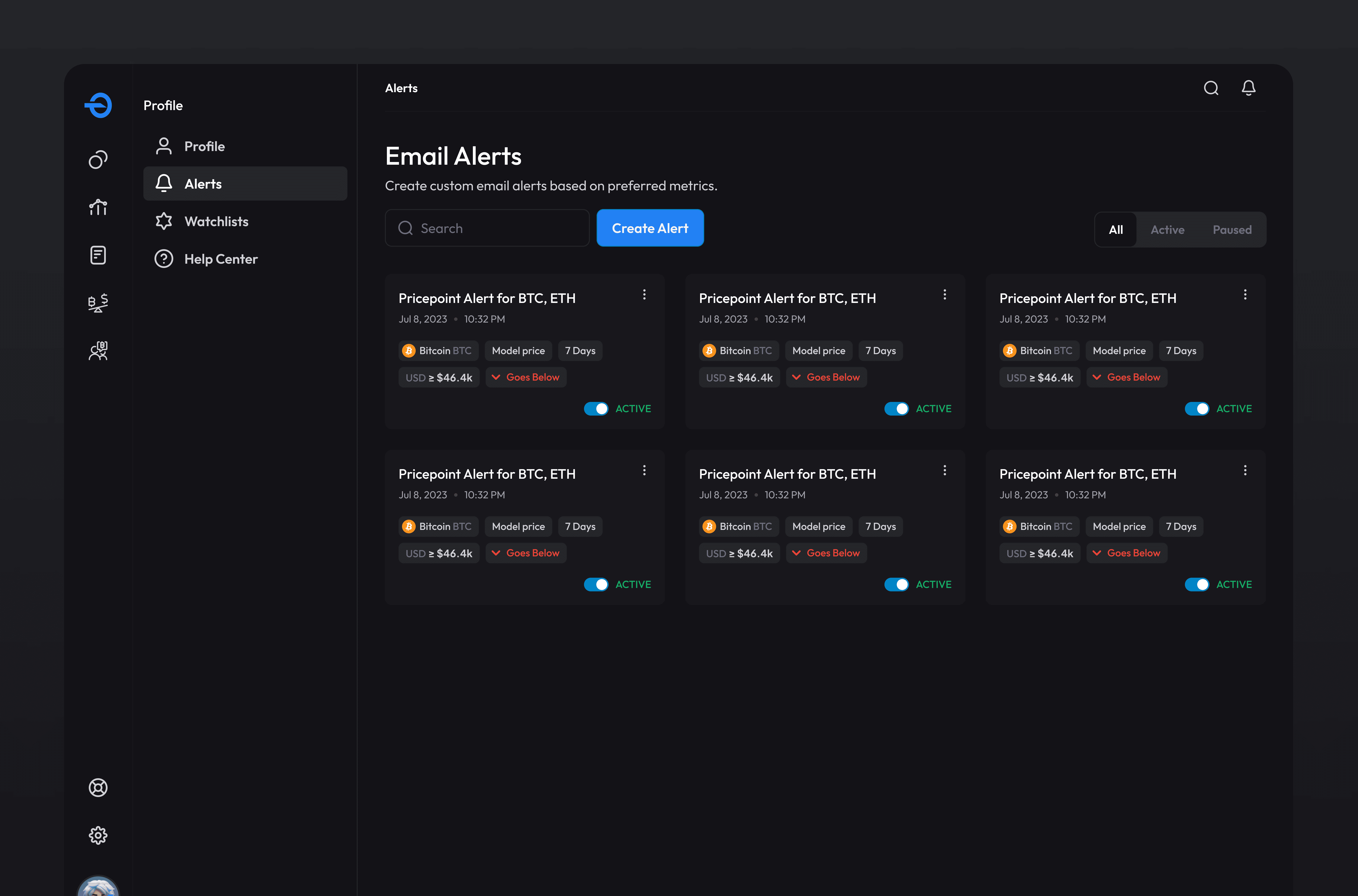
One of the biggest product opportunities was helping users return to assets they cared about. Before the redesign, users could research a token, but there was limited structure around what happened next. I introduced watchlists as a natural continuation of research. When users found a token worth monitoring, they could save it, track its movement, and return to it later without starting from scratch. This helped shift DYOR from one-time exploration to personalized research.
4. Making alerts part of the decision workflow
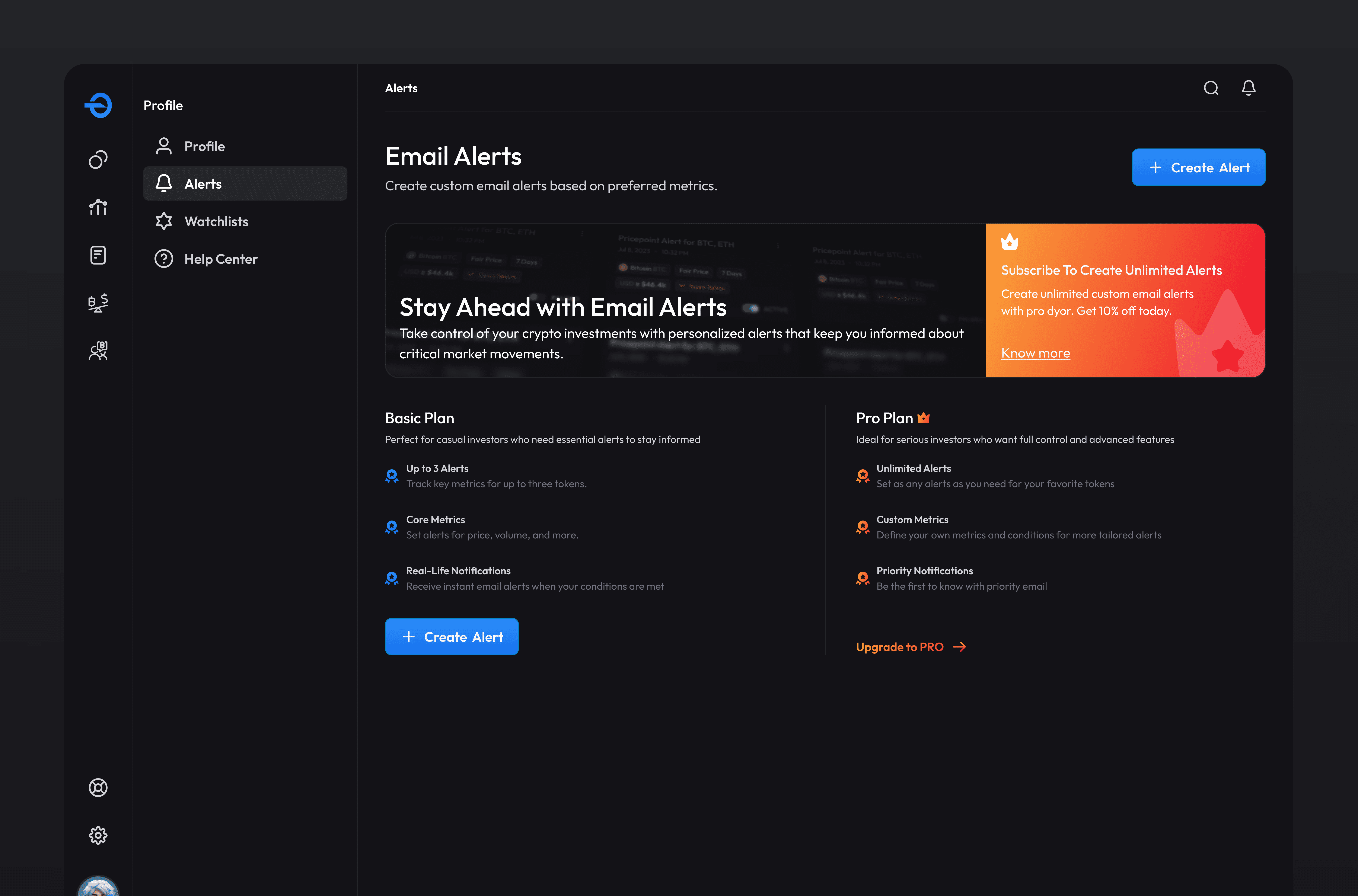
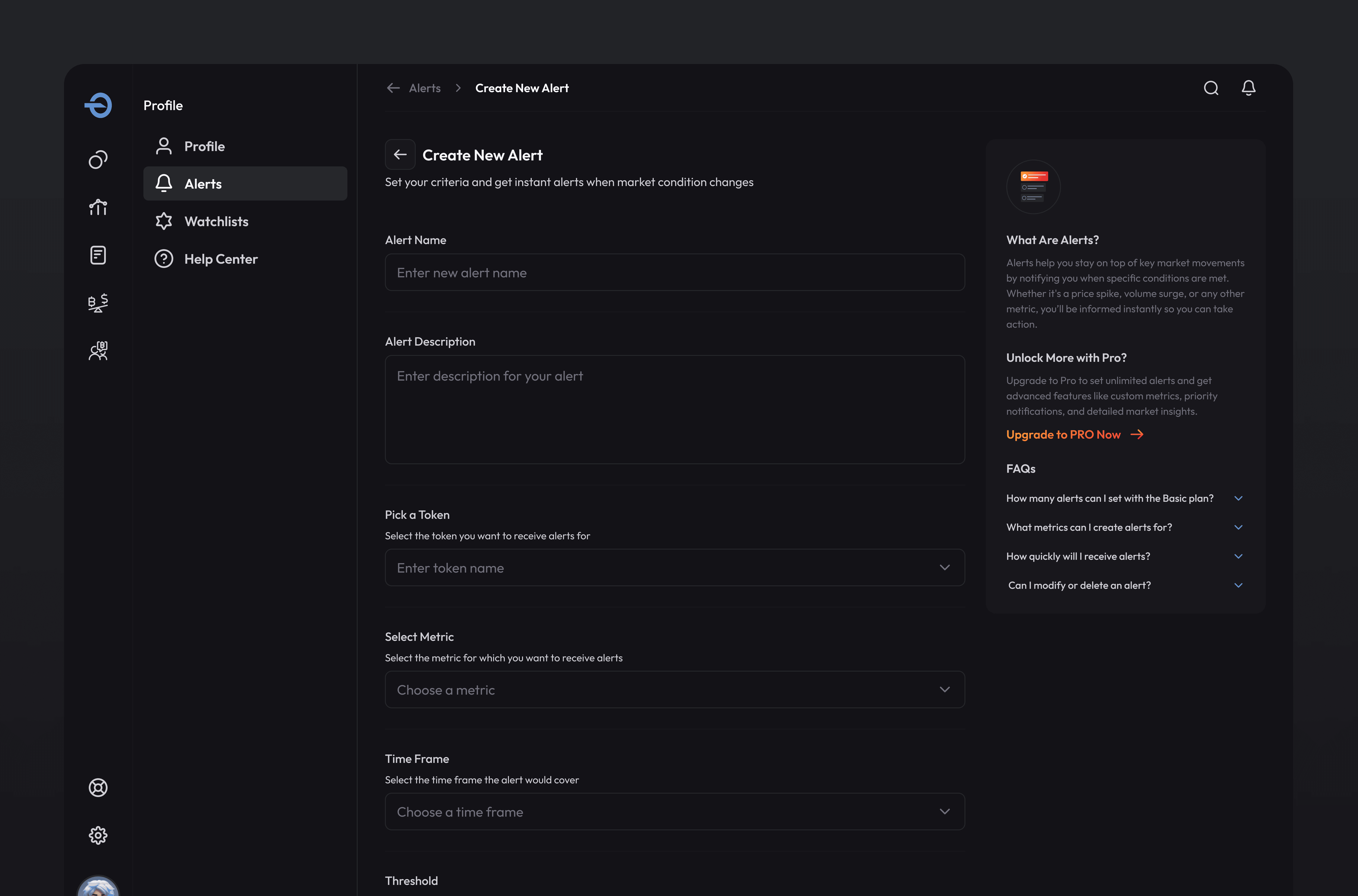
Alerts were designed to reduce the burden of constant manual checking. Instead of expecting users to repeatedly revisit tokens, the system could bring them back when a meaningful change happened. The alert experience was designed to be simple, specific, and action-oriented. Users could define what they cared about, set thresholds, and return to the platform when there was a reason to investigate again.
This created a stronger engagement loop:
Find token → Save to watchlist → Set alert → Return on signal → Investigate again
5. Designing a modular system for dense data
Crypto products repeat the same UI problems again and again: metric cards, dense tables, filters, charts, badges, tooltips, comparison states, empty states, and alert conditions. To keep the product scalable, I designed a modular component system that could support future dashboards without creating inconsistent patterns.
The system included:
Metric cards
Data tables
Filter groups
Chart modules
Status badges
Tooltip patterns
Empty states
Watchlist controls
Alert creation patterns
This helped the product feel more consistent while also making future dashboard expansion faster.
Testing and iteration
After designing the core flows, we tested whether users could complete key research tasks without guidance.
We focused on questions like:
Can users quickly understand what the dashboard is showing?
Can they find a token and evaluate its current status?
Can they compare coins using filters and tables?
Can they understand the difference between top-level signals and deeper metrics?
Can they save a token to a watchlist?
Can they create an alert without confusion?
The testing helped refine the product in several ways. We simplified the dashboard hierarchy, made filters more visible, grouped metrics by decision relevance, improved empty states, and added more contextual labels around complex data. These iterations made the experience easier to scan while preserving the depth advanced users expected.
Outcome
The redesign helped DYOR become more than a dashboard. It became a structured research workspace. Users were able to discover assets, evaluate them with clearer context, save tokens for later, and return through alerts when something changed.
The product saw stronger engagement after the redesign:
Average engagement time increased by 65% in 3 months
Watchlists and alerts were adopted by 60% of active users
Weekly active users grew from 435 to 7,768
Platform reached 36K+ users
Dashboard views crossed 770K+
For me, the most meaningful outcome was that users were not just spending more time in the product. They were using it in a more intentional way. They were building research workflows.
Reflection
DYOR taught me that data-heavy products do not become usable just by adding better charts, more filters, or cleaner UI. The real design challenge is deciding what deserves attention first.
In crypto, users are not only looking for information. They are trying to build confidence under uncertainty.
This project pushed me to design for progressive understanding: helping users scan quickly, investigate deeply, and return when something changes.
If I were continuing the product today, I would focus on improving explainability even further. I would explore AI-assisted token summaries, clearer risk signals, comparison workflows, and saved research templates for different investor types.
The next opportunity would be to make DYOR not just a research dashboard, but an intelligent research companion.
Scope of Work


