Designing trust into Scopex’s non-custodial remittance flow
Client
Scopex
Year
2025

I redesigned the approval and recovery experience inside Scopex’s send flow so users could understand where their money was after bank debit, why one more approval was required, and how to recover safely if they missed the moment to act. The result was a major improvement in user behaviour after approval became available: median time-to-act fell from 37 minutes to 1 minute, and transfers stuck beyond 24 hours fell from 5.09% to 0.12%.
Role | Sole product designer, partnering with engineering, finance & business. |
Scope | Approval model, recovery surfaces, rate-lock logic, expiry path, multi-wallet approval handling, UX writing, UI states, and post-launch measurement. |
Timeline | Q4 2025; designed and shipped in roughly 4–6 weeks |
Platform | IOS & Android mobile app |
TL;DR
Scopex is a remittance product for NRIs sending money home to India. Under its non-custodial architecture, a transfer could not complete automatically after the user’s bank was debited. Funds first moved into a wallet the user technically controlled, and the user then had to authorise release to the recipient with a passkey. That second approval was architecturally required, but the previous UX made it easy to miss and hard to understand. I reframed the problem from “how do we explain a weird blockchain step?” to “how do we make transfer state visible, trustworthy, and recoverable?” Then I designed a five-stage process tracker, wallet visibility, a bounded rate-lock window, a multi-surface recovery system, a safe expiry flow, and a jargon-free pattern for split-wallet transfers that required two approvals.
The flow that lost us most first-time senders
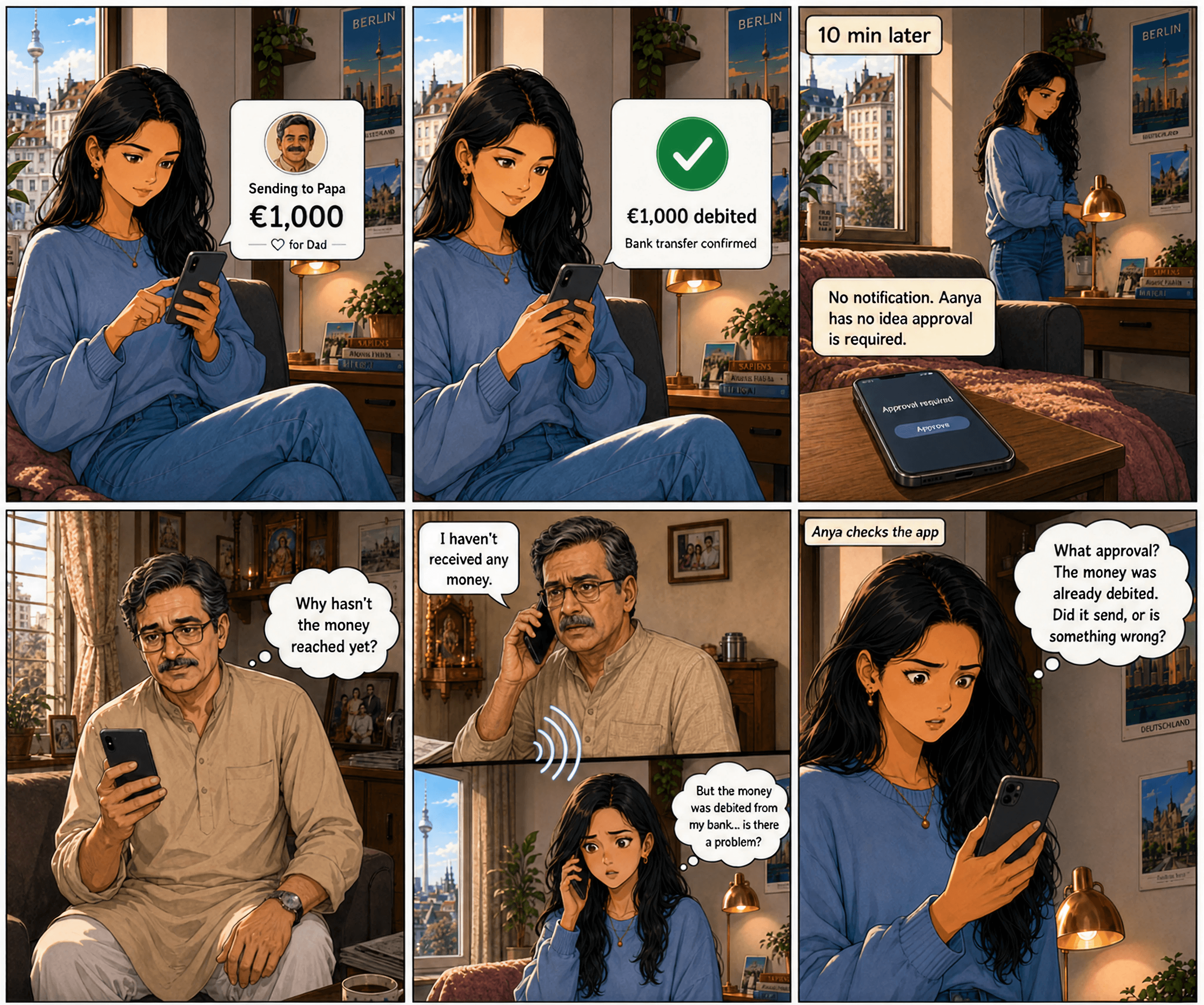
Aanya, in Berlin, hits send on a ₹99,000 transfer to her father in Mumbai. Her bank confirms the €1,000 debit. She closes the app. Ten minutes later, the app asks her to approve the transfer. But the money is already gone from her bank. What's wrong?
She gets confused.
Aanya wasn't unique. Originally the median user took 37 minutes to notice and act on the approval. One in twenty took longer than 24 hours. They weren't slow. They didn't know. The product gave them no signal. They had to open the app, navigate to Transfers, and check status manually.
Their money was debited. Their fathers in Mumbai were waiting.
The second tap can't be removed. It's how the architecture works. This case study is what I built in 20 days to bring the median time-to-act to 1 minute. And the argument I lost along the way.
The constraint
Scopex is a zero-fee remittance product for the Indian diaspora. NRIs sending home to family. Typical ticket €1,000 (~₹99,000), monthly cadence. Rates 25 paise better than mid-market, no fees, ~30-minute end-to-end delivery in 80–85% of transfers.
Under the hood, non-custodial blockchain rails. Money moves in two parts. First from the user's bank into a wallet they technically own. Then from the wallet to the recipient's Indian bank, gated by a passkey signature: Face ID, Touch ID, biometrics. No signature, no movement.

The second tap can't be eliminated. Scopex can't auto-release funds from a wallet it doesn't custody.
Three other architectural truths shaped every decision:
Rate-lock window. Once we quote a rate, we hold it. Scopex absorbs FX risk inside that window.
Optimistic concurrency. The wallet doesn't lock funds per transfer. First to approve wins.
Multi-chain reality. A minority of users have funds split across two on-chain wallets. The UI shows one balance. The send technically needs two signatures.
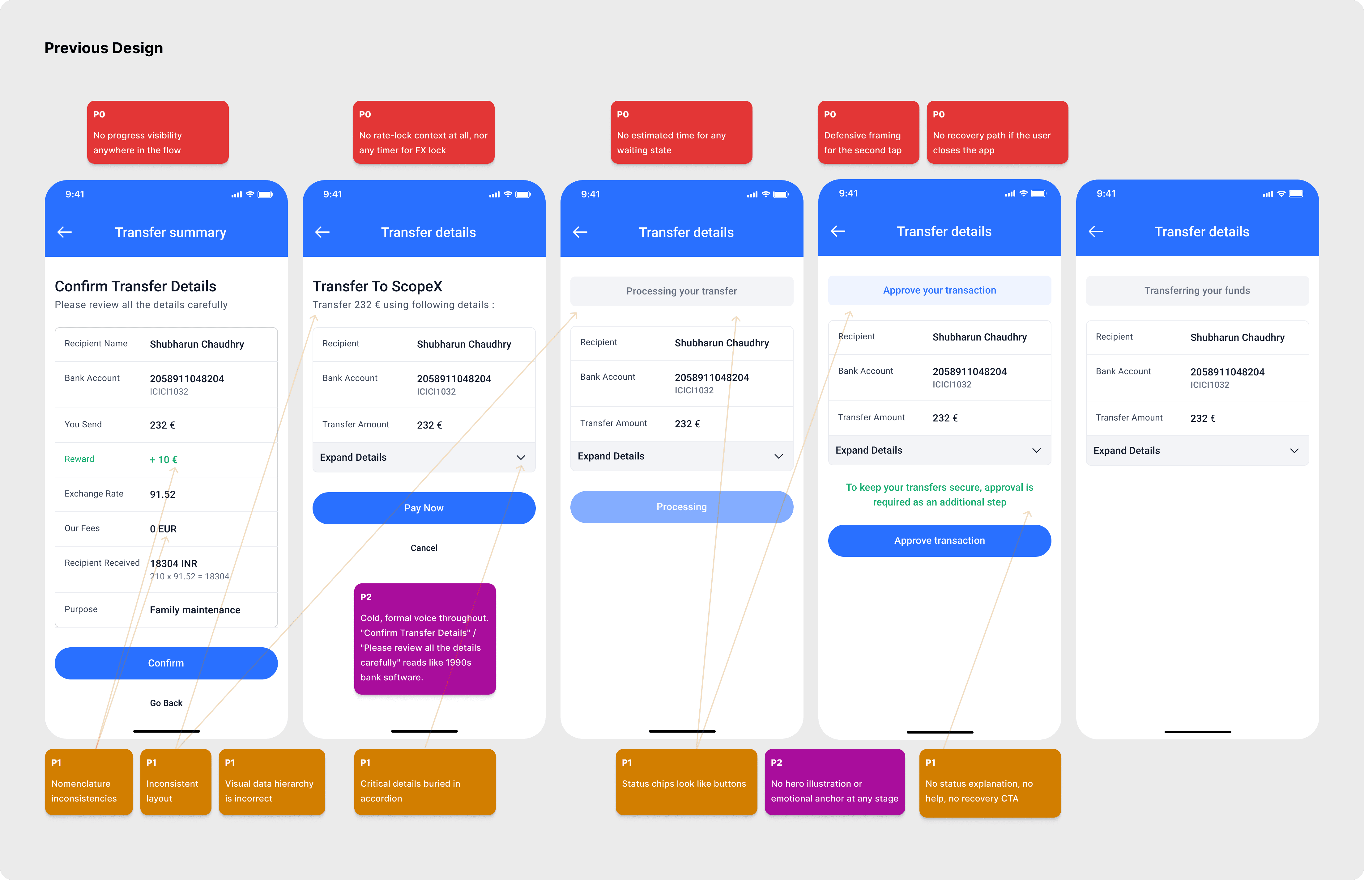
Before, what I inherited
The send flow existed before I joined. Money moved. People received it. But the design apologised for the second tap, and gave users no map of where they were in the process.
Design principles I used to make decisions
The principles behind the redesign were straightforward:
Make invisible system state visible.
Declare friction before users feel it.
Translate architecture; do not leak jargon.
Design recovery as part of the happy path.
Protect trust when the system cannot complete immediately.
Five decisions
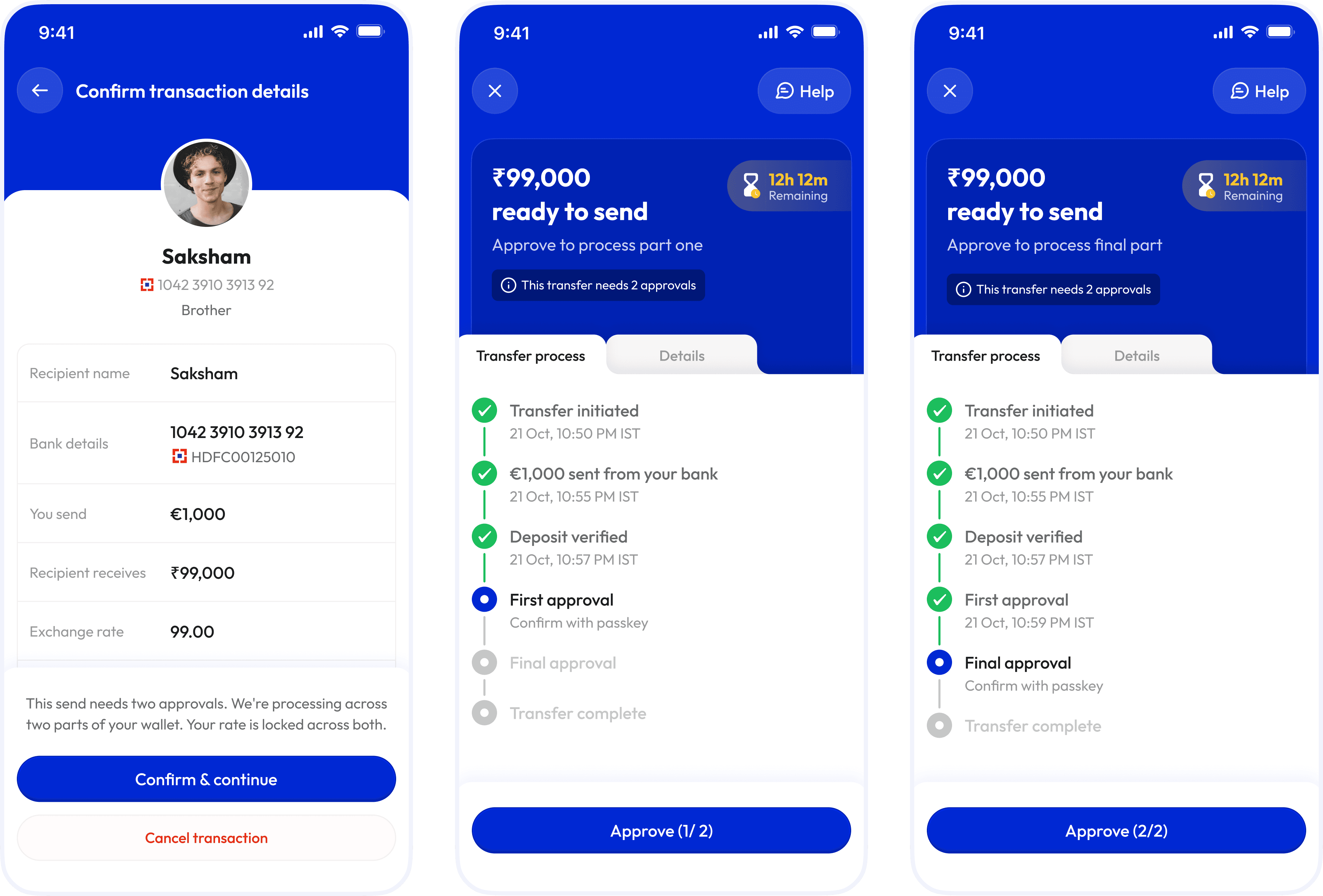
Decision one: show the whole send, not just the next screen
User problem: Users could not tell where their money was or why another approval was necessary.
Business reason: In remittances, unexplained waiting after debit damages trust and increases avoidable drop-off.
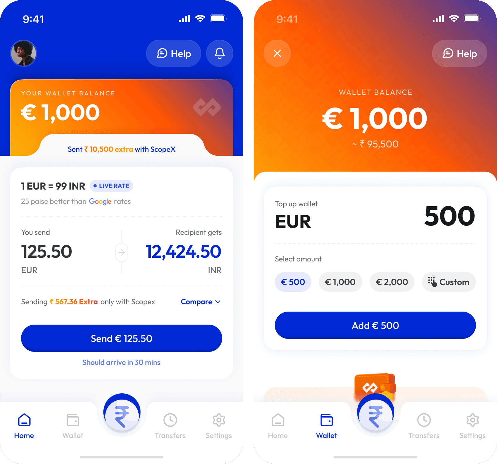
Design decision: I introduced a persistent five-stage process tracker, paired with a stage-aware hero card and real-time wallet visibility.
Why this beat the alternative: The previous “for your security” framing was defensive and misleading. A tracker gave users a truthful mental model of the system and scaled more cleanly to one-approval and two-approval cases.
Trade-off: This approach exposed more operational detail in the UI, but that complexity was still easier to understand than invisible architecture.
What changed: Approval stopped feeling like a surprise interruption and started feeling like an expected stage in the journey. The wallet became proof that the money was safe and waiting for user release.
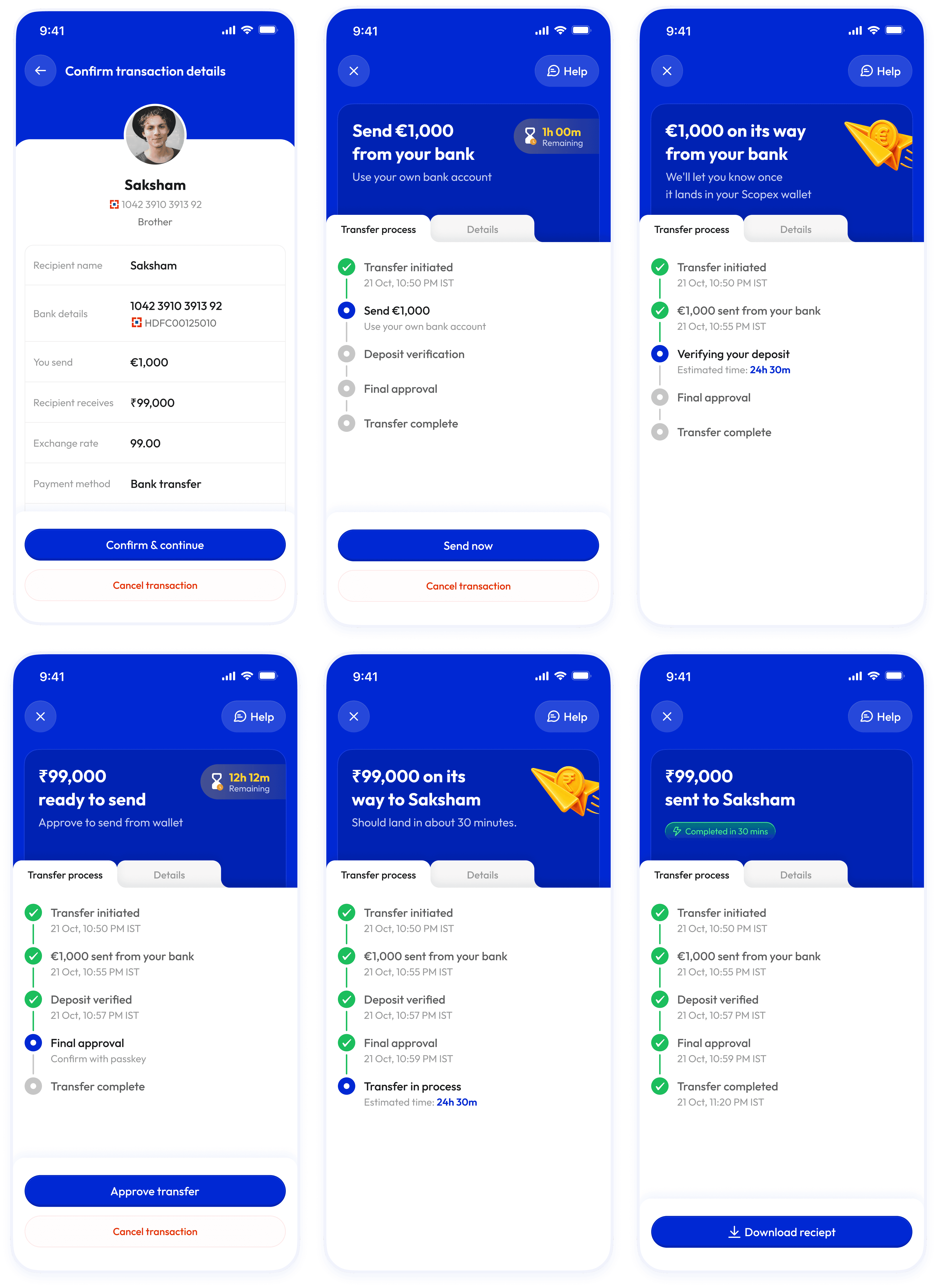
I also added the wallet to the interface. The old design didn't show one. Users couldn't see where their money sat between bank debit and final transfer, or understand why a second tap was needed at all. The new wallet shows the funds in real time. The second tap now reads as releasing money from the user's own wallet, not a redundant security step. If a passkey fails or anything breaks, the money is still visible. The wallet isn't storage. It's a trust anchor.
Decision two: turn the rate-lock window into an explicit product promise
User problem: If users came back later, the product needed a clear answer to “Can I still send at the rate I saw?”
Business reason: A longer window protected completion but increased FX exposure; a shorter window limited risk but made missed approvals more punishing.
Design decision: I worked with engineering and finance to set a 24-hour rate-lock window, then designed the flow so that the locked rate was visible and understandable.
Why this beat the alternatives: The public write-up makes clear that 24 hours was not arbitrary; it was the longest duration the business could support without unacceptable exposure. That is exactly the kind of cross-functional trade-off senior designers should surface.
Trade-off: The business absorbed bounded FX risk in exchange for a safer recovery window.
What changed: Users had a clear time boundary and a fair opportunity to recover if they legitimately missed approval readiness.
Decision three: build a recovery system, not a single reminder
User problem: Almost every incomplete transfer failed the same way: users did not realise approval was ready.
Business reason: Relying on users to remember to check the app wastes the banked intent that already exists after debit.
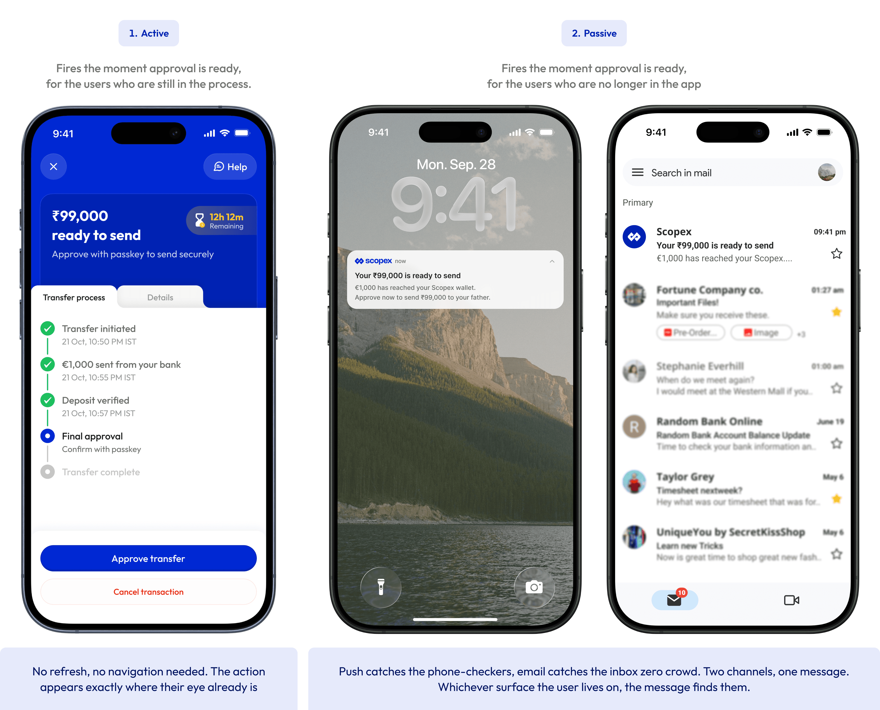
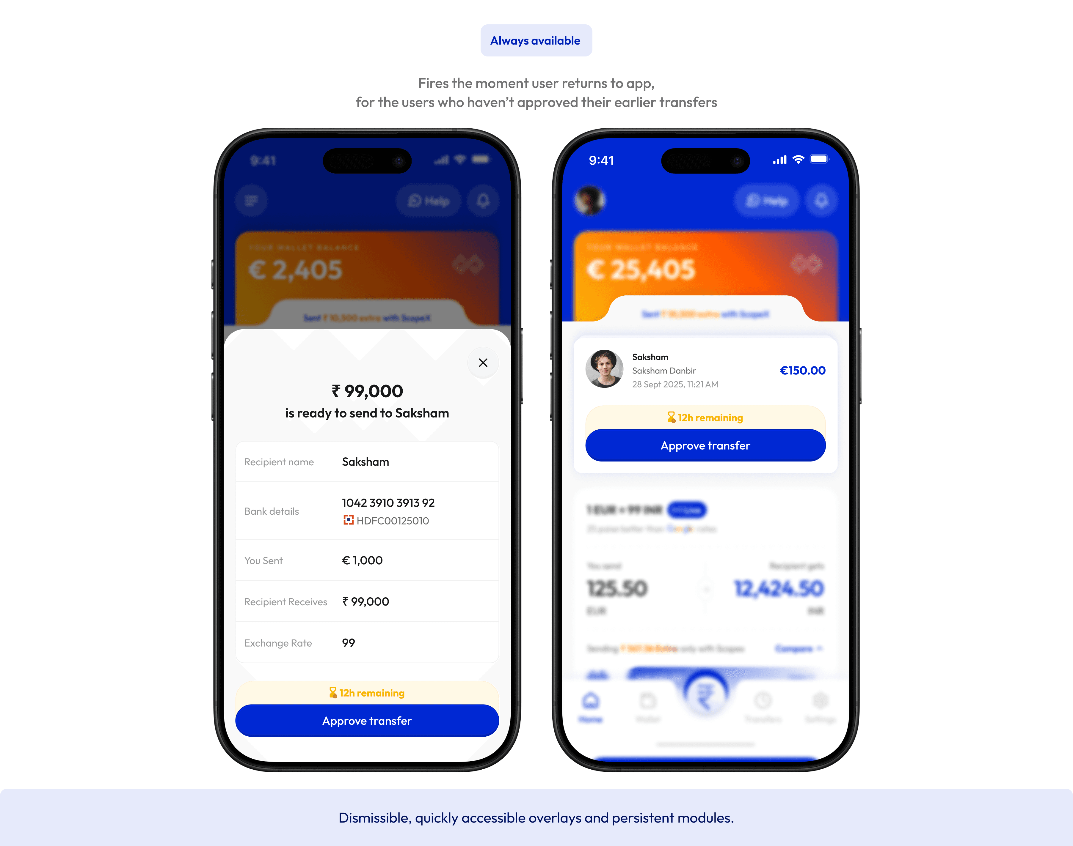
Design decision: I built a five-touchpoint recovery cascade, using surfaces that escalated in interruption strength, including in-app state, push, a blocking sheet, and persistent recovery surfaces.
Why this beat the alternatives: A single push notification or a hidden status screen asks too much of user memory. A recovery system gives people multiple chances to re-enter the flow from wherever they are.
Trade-off: More surfaces meant more instrumentation, more state coordination, and a future need to simplify based on performance.
What changed: Users could recover without manually hunting through the app, and the long tail of missed approvals compressed sharply.
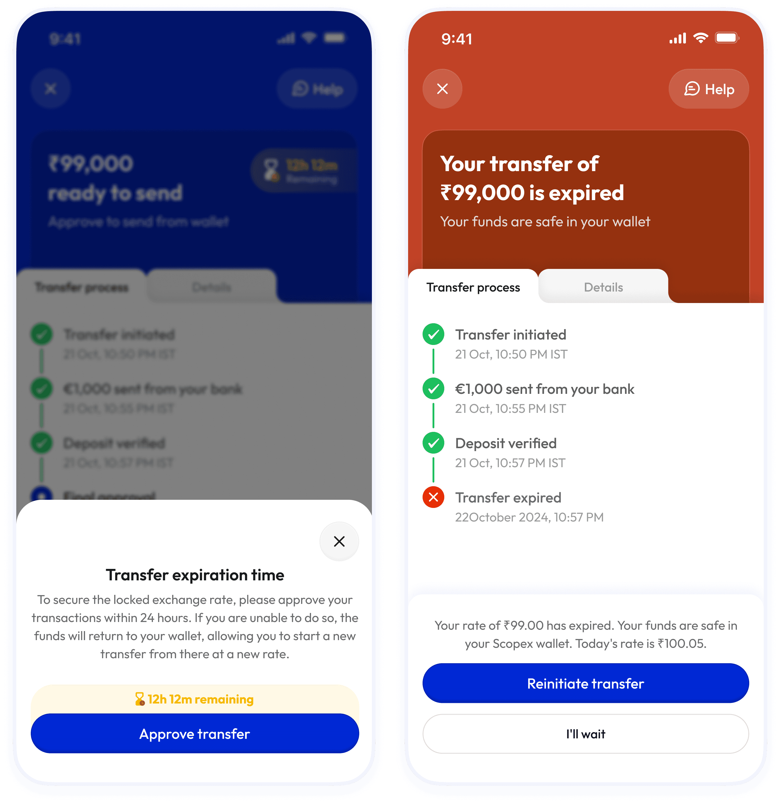
Decision four: make expiry safe, explicit, and recoverable
User problem: If a rate expired, the product risked making users feel their money had disappeared or their effort had been wasted.
Business reason: Trust breaks fastest when a payments experience looks like it failed after debit.
Design decision: I designed expiry as a no-loss state: the transfer expired, but the funds remained visible in the user’s Scopex wallet. The screen explicitly showed the expired rate, the current rate, and two actions: resend at today’s rate or wait. I also added a one-tap replicate path so users did not need to re-enter the transfer manually.
Why this beat the alternatives: A dead-end or forced restart would have added unnecessary friction and made the product feel less trustworthy.
Trade-off: Users still faced a possible rate disadvantage on resend, but the trade-off was explicit rather than hidden.
What changed: Expiry became understandable and reversible instead of confusing and punitive.
Decision five: translate multi-chain complexity into banking language users can understand
User problem: A minority of users needed two approvals because their funds were split across two wallets, but exposing “different chains” mid-transfer would have added cognitive load at exactly the wrong moment.
Business reason: The product needed to remain honest about what was happening without forcing users to learn blockchain vocabulary.
Design decision: I framed the state as “two parts of your wallet” and declared the need for two approvals before money moved. The approval flow then showed Approval 1 of 2 and Approval 2 of 2 with visible progress between them.
Why this beat the alternatives: Hiding the complexity would have created surprise; overexplaining the technology would have created confusion. This framing translated the system into familiar financial language.
Trade-off: The UI introduced one extra conceptual model, but it was intuitive and truthful enough to preserve trust.
What changed: Users were told what to expect upfront, and the additional signature felt like a declared part of the journey rather than a failure or glitch.
Decision six: handle optimistic concurrency honestly, and say where I still disagreed
User problem: If users initiated more than one transfer, the first approval to execute could consume balance before another pending transfer was completed.
Business reason: Business stakeholders were concerned that locked or “reserved” funds would feel frozen and reduce transfer flexibility.
Design decision: The shipped compromise kept optimistic concurrency and added a clean “add money to proceed” fallback.
Why this shipped: It reduced operational and UX overhead versus introducing full balance reservation as a default.
Trade-off: I still believe reserved balances would better match user mental models for frequent senders. The current approach works, but it leaves a race condition edge case alive.
What changed: Instead of pretending the trade-off did not exist, I documented it and would still revisit it later for higher-frequency users. That is an important part of the project story, because senior product design is often about making the best decision available, not the perfect one.
Final experience
The redesigned journey works like this: before users send, they can see the full transfer lifecycle and whether one or two approvals will be required. After bank initiation, the process tracker and wallet keep state visible. When approval is ready, the product uses layered recovery surfaces to bring users back without relying on memory alone. If they miss the rate-lock window, the funds remain safe in wallet and the transfer can be recreated in one tap at the current rate. If another approved transfer has already consumed balance, the experience offers a clear recovery path instead of an ambiguous failure.
Impact
The redesign launched in late Q4 2025. The public comparison covers roughly six weeks before launch and two months after launch, and the measurement definition is one of the best parts of the case study: time-to-act begins only once approval is actually ready, which removes bank verification latency from the metric and makes the result a cleaner measure of design impact.
The published outcomes are strong and credible:
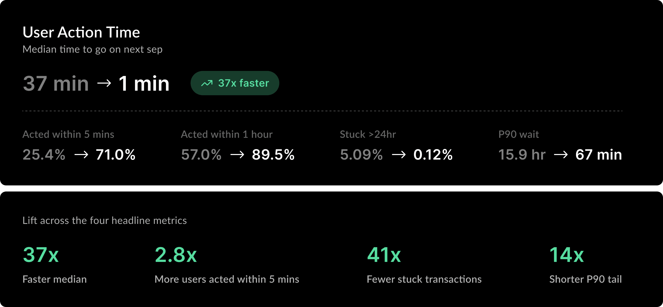
Median time-to-act: 37 minutes → 1 minute.
Transfers stuck beyond 24 hours: 5.09% → 0.12%.
Users acting within 5 minutes of approval readiness: 25.4% → 71.0%.
P90 time-to-act: 15.9 hours → 67 minutes.
The qualitative signals are just as useful. Session recordings showed that users who returned to the app via the blocking sheet approved within seconds, and support tickets shifted from vague confusion to more precise stage-based language such as being “stuck on final approval”. That suggests the redesign did more than improve conversion behaviour; it also gave users a clearer mental model of the system. Directionally, that should reduce avoidable support load and the cost of transfers sitting idle under a locked rate, although the public materials do not include a ticket-volume, revenue, or FX-loss delta.
What I learned
This project is strongest when it shows both shipping judgement and intellectual honesty. I would keep that tone. One of the most useful parts of the story is the argument I lost: I pushed for balance reservation because it better matched how users think about earmarked money, but the business chose flexibility over reservation. The project also honestly names what still needs validation: which recovery surface did the most work, and which ones should eventually be simplified. That kind of reflection makes the case study feel more senior, not less.
What I would improve next
The next iteration would focus on three things. First, I would instrument the recovery cascade at the surface level to understand which touchpoints truly drive action and which add noise. Second, I would revisit balance reservation for a narrow segment of repeat or high-frequency senders instead of making it the default for everyone. Third, I would pressure-test whether the “full journey from the start” framing can become even simpler without losing its trust-building function. The goal would not be more UI. The goal would be a more efficient trust model.
Closing line
This project did not change the underlying wallet architecture. It changed how clearly the product explained it, how confidently users could act inside it, and how safely they could recover when real life pulled them away. That is the kind of product design work I want to keep doing: reducing ambiguity at the point where user trust and business risk collide.
Scope of Work


